IELTS Writing
فرمت کلی
• مدت زمان: ۶۰ دقیقه
• تعداد تسکها: ۲ تسک (Task 1 و Task 2)
• نمرهدهی: از ۰ تا ۹ بر اساس معیارهای Task Achievement / Response, Coherence & Cohesion, Lexical Resource, Grammatical Range & Accuracy
Task 1
• Academic IELTS:
• باید یک گراف، جدول، نمودار یا دیاگرام را توصیف کنید.
• هدف این است که اطلاعات دادهشده را تحلیل و خلاصهسازی کنید، نه ارائه نظر شخصی.
• طول نوشته: حدود ۱۵۰ کلمه
• مدت زمان پیشنهادی: ۲۰ دقیقه
• General IELTS:
• باید یک نامه رسمی، نیمهرسمی یا دوستانه بنویسید.
• طول نوشته: حداقل ۱۵۰ کلمه
• تمرکز بر رعایت لحن و نوع نامه است.
Task 2
• Academic و General IELTS:
• یک مقاله (Essay) در پاسخ به یک سؤال یا موضوع ارائه میدهید.
• باید نظر خود را با دلایل و مثالها پشتیبانی کنید.
• طول نوشته: حداقل ۲۵۰ کلمه
• مدت زمان پیشنهادی: ۴۰ دقیقه
• معیار نمرهدهی شامل وضوح بیان، سازماندهی پاراگرافها، دایره لغات و گرامر است.
Writing Task 1 Sample
You should spend about 20 minutes on this task.
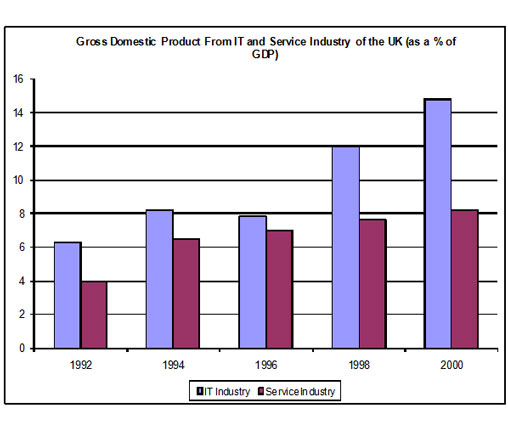
The chart shows components of GDP in the UK from 1992 to 2000.
Summarize the information by selecting and reporting the main features and make comparisons where relevant.
Write at least 150 words.
sample anwser
The bar chart illustrates the gross domestic product generated from the IT and Service Industry in the UK from 1992 to 2000. It is measured in percentages. Overall, it can be seen that both increased as a percentage of GDP, but IT remained at a higher rate throughout this time.
At the beginning of the period, in 1992, the Service Industry accounted for 4 per cent of GDP, whereas IT exceeded this, at just over 6 per cent. Over the next four years, the levels became more similar, with both components standing between 6 and just over 8 per cent. IT was still higher overall, though it dropped slightly from 1994 to 1996.
However, over the following four years, the patterns of the two components were noticeably different. The percentage of GDP from IT increased quite sharply to 12 in 1998 and then nearly 15 in 2000, while the Service Industry stayed nearly the same, increasing to only 8 per cent.
At the end of the period, the percentage of GDP from IT was almost twice that of the Service Industry.
(182 Words)
Sample Task 1
You should spend about 20 minutes on this task.
The following bar chart shows the different modes of transport used to travel to and from work in one European city in 1960, 1980 and 2000.
Summarize the information by selecting and reporting the main features and make comparisons where relevant.
Write at least 150 words.
sample anwser
The bar chart shows the changing patterns of transport use in a European city during the period from 1960 to 2000. In brief, the chart shows that the use of the car as a means of transport dramatically increased over the period shown, while the others fell.
In detail, in 1960 the motor car was used least as a method of transport with only about 7% of the population using this method but car use grew steadily and strongly to finally reach about 37% of the population by 2000. This was a massive 5-fold increase in use.
Over this same period, however, the popularity of walking, which had been the most popular means of transport with 35% of the population in 1960 having it as their preferred way of getting around, fell to 10%. Bicycle use also fell from a high of about 27% in 1960 to just 7% in 2000.
On the other hand, bus use was more erratic being popular with almost 20% of the population in 1960 and rising to a peak of about 27% in 1980 before falling back to about 18% in 2000.
(188 Words)